Visualize your Website Structure with Gephi to recognize flaws and more.

Sometimes it is necessary to actually visualize data to make it understandable and easier to comprehend, even for people who are not that much in technical SEO. Visualization usually helps everyone to understand complex things better – therefore I wrote a tutorial on how to use Gephi (a visualization tool) and other Software like Screaming Frog for it.
What is Gephi?
Gephi, per definition, is “open-source software for network visualization and analysis. It helps data analysts to intuitively reveal patterns and trends, highlight outliers and tells stories with their data. It uses a 3D render engine to display large graphs in real-time and to speed up the exploration.” You may download the tool for free here: https://gephi.org/
That said, this tool can do most of the part when it comes to visualizing a huge amount of data. But beware, it has a lot of settings and finding the best one for your project can sometimes be a hassle. I will list my best settings that I’ve discovered so far for you but if these work for you is something I can’t guess and there might/will be situations when the suggested visualization might not be the best.
Step 1: Obtaining your data
My tool of choice for crawling a website is Screaming Frog. If you have a website with less than 500 URLs, you may use Screaming Frog for free – you just have to download it here: https://www.screamingfrog.co.uk/seo-spider/.
Set Screaming Frog to crawl your website (you might just need the URLs for HTML-Pages in that case so make sure to configure it like that, as long as you are using the free version. If you happen to have the full version, there is no need for you to worry about that, because you can use the software as is. (I personally just tend to change the header information transmitted by Screaming Frog to something else than the Screaming Frog bot, to make sure that website owners do not that easily see, which software has been used).
So, the data used in this article comes directly from Screaming Frog.
Once Screaming Frog has crawled your website, it’s time to export and clean up your data first before you can actually use it. So go to Bulk Export > Response Codes > Success (2xx) Inlinks which will export all your internal, incoming (or better: internal) links.
This will give you a list which should look like this following screenshot.
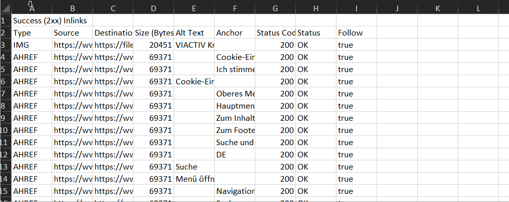
To further clean up your data, make sure that you e.g. search for URLs which contain #, ? or, in case you are not interested, URLs that link to images. Sometimes it makes sense to filter out images, too, even so, I encourage you to leave images inside the analyzation.
Step 2: Saving as .csv file and import to Gephi
Save your list after checking for irregular URLs (filtering for URLs with “#” or “?”). Now it’s time to open up Gephi and start your first project.
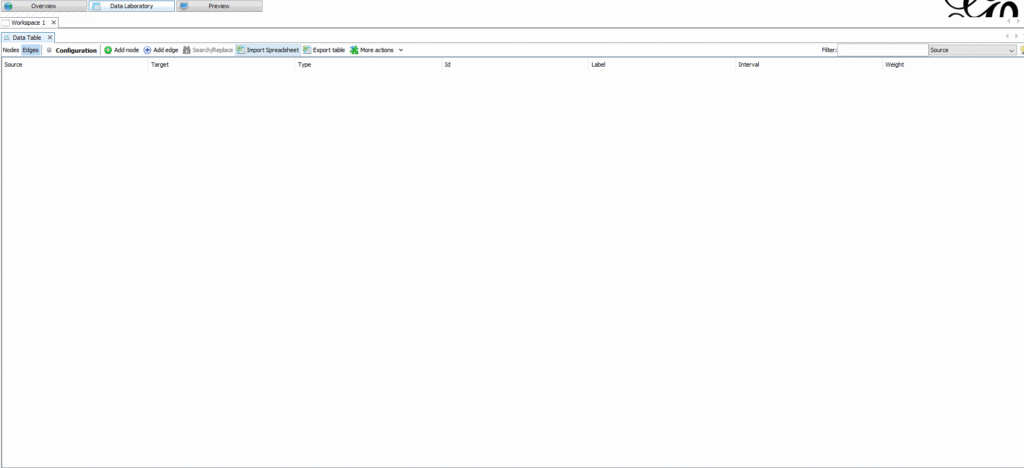
You may now import your comma separated .csv file to Gephi as a Edges-table and continue from there.
Step 3: Calculate PageRank and Modularity
Having loaded the .csv into Gephi, it’s now time to switch to your Overview Tab and find the Statistics Tab probably situated on the right side of your screen.
There you can find the PageRank command. Press the “Run” Button and make sure that you use the following settings.
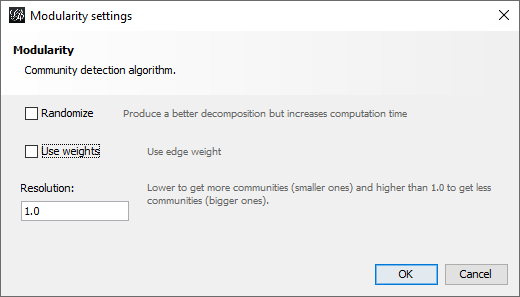
After that, it’s time to calculate the Modularity settings. Here you can use the following numbers and options. Make sure, not to activate “Use weights”.
Now do the exact same with the “Edges Tables” in Gephi. Make sure to add it to your existing workspace, because you will need both data tables for continuing with this visualization. You may ignore occurring errors if you’d like as I did. Because calculating more than 60k inlinks… well, in the end, I don’t care whether some are wrong or not.
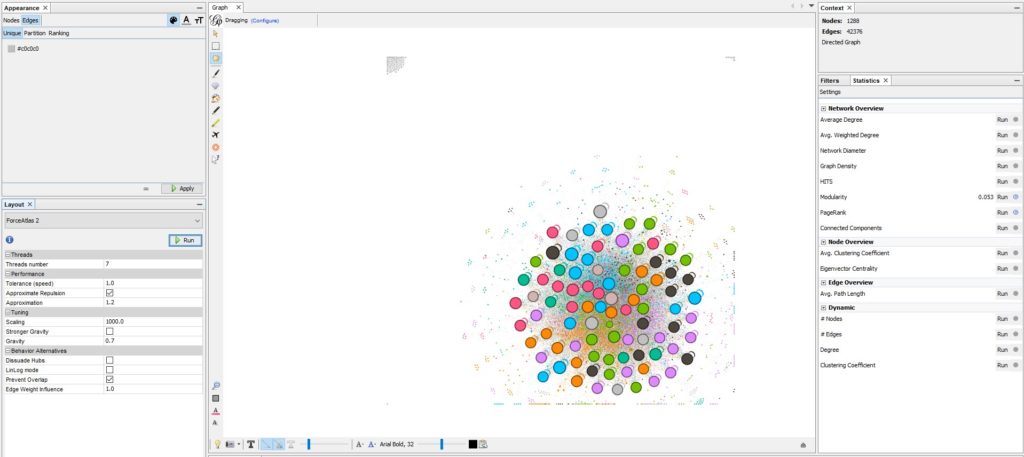
Step 4: Visualizing your data
After loading in your data and jumping back to the “Overview” option, you will most likely see a black square. Now it’s time to start the visualization process to help others understand your site structure better.
You can find my favourit settings for a basic site visualization below. Here are my changes that I made:
Layout: Force Atlas 2
Scaling –> 1000.0
Gravity –> 0.7
Prevent Overlap –> Check
Click Run
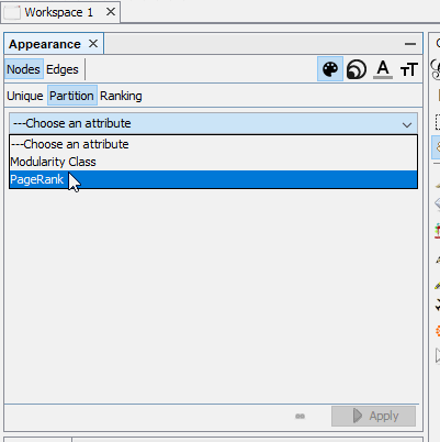
Appearance: Nodes
For the appearance of all Nodes in your new graph – choose the following settings in the Appearance Tab for colors and size of the nodes.
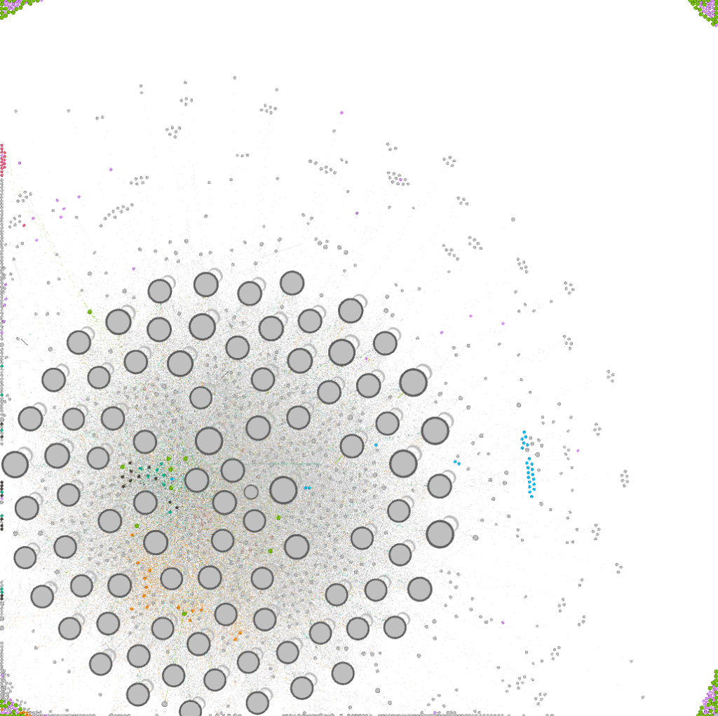
The First Output Result
The final Output (with slightly different color-settings)
Conclusion
Gephi offers an easy and quick way to visualize a huge amount of data, but on the downside, depending on your data, it might be that the settings provided here in this little tutorial might not be suitable for you.
But still – in the end, its a powerful tool that can help a lot and might impress the one or the other client, data scientist or CEO.
In this example, you can see that this website does not really have a lot of “content hubs”. There are one main page and bulk of larger pages around it that are cross-linking each other. There are many smaller pages within their circle, which means that the site structure is in general pretty single focused.
So the page does not really offer a good site structure with several content hubs.